Increasing user confidence in connecting a bank account to ClearScore
Senior Product Designer
May 2022 - October 2022
Project overview
ClearScore is a credit report app based in the UK. I worked as a Senior Product Designer on the credit marketplace squad where I collaborated closely with content designers, product managers and a wider engineering team. My role was to lead the design process of the team whilst also delivering design and research outputs.
In 2022 ClearScore launched a proposition called ClearSaver. With ClearSaver users can connect their bank account through open banking in order to get exclusive rates on loans and credit card offers.
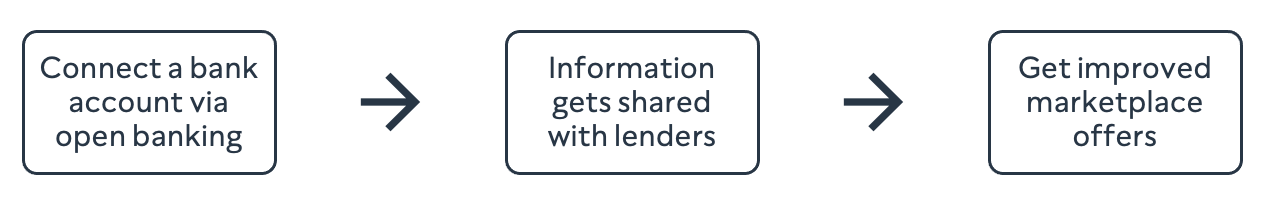
How the ClearSaver proposition works
Problem
Post launch, there was low conversion of this bank account linking journey. In particular we were seeing a high drop off at the beginning of the journey after the first two landing pages.
This meant that users were missing out on the best possible offers in our marketplace. ClearScore was also unable to collect open banking data and get a fully rounded view of user’s finances.
The existing journey where we saw a large drop off after the landing page of those users entering the journey.
Goal
Problem statement
How might we increase user confidence in connecting a bank account with ClearScore?
Success measures
- Decrease drop off after the landing pages
- Increase conversion of users linking a bank account
Gaining insights
Our squad took both a quantitative and qualitative approach to understanding why users were dropping off and not connecting a bank account.
Qualitative research
I designed and facilitated a moderated research study which was conducted remotely. During the sessions I spoke to participants and observed them using the ClearScore app. During the sessions users were asked how likely they would be to connect a bank account and why. I also ensured that engineers working on the project were present during the testing sessions so that they could hear the user feedback first hand.
I created the research plan and facilitation guide using Notion then recruited and set up the interviews through usertesting.com. Once the interviews were complete I synthesised the results and prepared a research report with Powerpoint which could be shared more widely.

Research process tools
The study uncovered that the main reason for drop off and users not connecting an account was concerns around data privacy and what was happening with personal data. User confidence in connecting an account was low, and we realised we needed to address user needs which would help us to increase that confidence. Through the research we were able to identify 3 key user needs that we wanted to address.
Key user needs identified:
- I need to feel in control of my personal data
- I need to get something in return for my personal data
- I need the experience of activating ClearSaver to be clear and simple
In terms of quantitative data our product manager also analysed another journey in the app where users are asked to link a bank account. We observed that in this journey there was a single landing page at the start compared to the two landing pages we were currently using. This lead us to the hypothesis that by removing a step in the journey and reducing physical friction we could increase overall conversion.
Opportunity
After looking at the quant and qual data I was able to define a two fold hypothesis that we believed would help to address our goal.
Our hypothesis:
IF
We consolidate information onto a single landing page AND IF we structure the content of the landing page in a way that is more likely to meet user needs
THEN
We expect to see an increase in the amount of users reaching the bank account screen and an overall increase in conversion
DUE TO
There being less physical friction the journey and users having more confidence to proceed from the information that has been presented to them
Solution
Creating a new content structure
As we were reducing the information to a single page and updating the content structure we had to re-think the content we were currently using. This meant going back to the drawing board to create content that was not overwhelming and would meet user needs.
I worked closely with the content designer on our squad to define what the new content structure should be. We first decided to do further user research in the form of a card sort to understand the way that users would most likely categorise and group the content.
I collected all the questions that users had asked as part of the initial research phase and conducted an open card sort to understand the categories and groupings that users would expect to see when it comes to learning about the proposition. I then analysed the findings along with the content designer so that we could use them as a basis for ideating on the page layout.

It was really interesting to see the content groupings that users had created matched up closely with the user needs we had previously identified.
Design ideation
From here we could then build out the content structure of our landing page using insights gathered from card sorting by answering user questions.
The final outcome was a collaboration between product design and content design. Initially we worked with basic wireframes and content blocks, then increased the fidelity as we became more confident the solution. This included sketching, wire-framing and lots of iteration of the UI in Figma.
Initial exploration of content structure
Exploring wireframes and page layouts
Iterating on visual design and final content
Final solution
The final solution was a single page design where were able to clearly map the user needs we had previously identified through research. We believed that by meeting these needs it would give users the confidence they needed to connect an account.
Before:

The previous design with information across two pages
After:

The new design with all the information on one page, addressing the three key user needs identified
Test
We launched the new experience and compared it to metrics for the previous experience.
Outcome:
- Overall bank account linking conversion increased by 10%
- Landing page drop-off decreased by 20%
Key project takeaway
Collaborating with all teams involved in the journey
We didn’t collaborate closely with the team responsible for marketing emails in relation to the journey we had designed. When users started entering the flow through that email journey we saw some unexpected results. In the future I will remember to consider the entire end to end user experience.