Building a new platform with a cross functional team
Product Designer
October 2018 - November 2018
Project overview
Cannes Lions is a prestigious award for the creative communications industry. The awards take place each year at a festival in Cannes. I worked on the website team to relaunch the platform.
Attendees on the beach in Cannes
Business needs
After constant iteration the website had become bloated and overwhelming. The navigation was confusing and there was no consistent brand experience. Due to the involvement of many business functions there was no accountability for the site experience.
The old site lacked consistency
Problem statement
How can we standardise the way website content is produced?
Success measure
New website platform launch
People before process
It was important to understand who was involved in the content creation process and the roles and responsibilities of everyone involved. This meant I was part of a cross functional team of people from Marketing, Brand, Engineering and Product. I was a keen advocate of us all coming to work in the same office for this project when usually we were in different locations. It was also key to have regular playbacks with business stakeholders.
Bringing people from across the business together
Discovery
Site audit
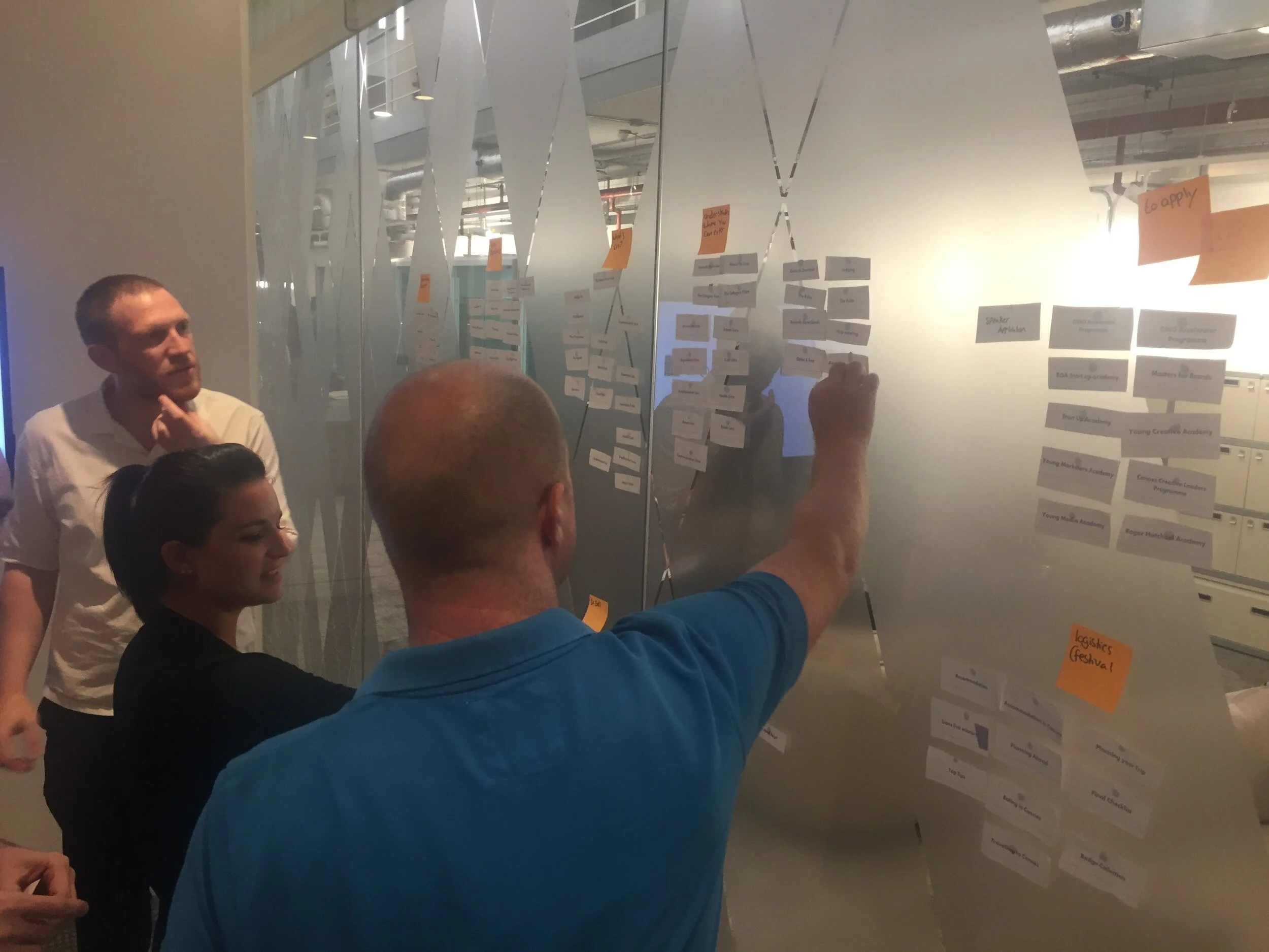
I led an audit by printing out the website and sticking the pages up around the office. We cut out components and grouped different types of pages. This allowed us to clearly see the inconsistencies in the brand and content experience. By auditing pages and components we could easily see the redundant and old content. This also informed how we could group content when designing.
Some pages from the site audit
Customer feedback
After hearing users feedback about the site we understood their pain points and why the site wasn’t working for them.
“I do not feel that the website is particularly clear or easy to navigate. Often you have to click many times to get to where you want to be.”
Customer feedback
Defining the problem
After our initial discovery phase it was clear that inconsistencies across the site were down to two factors. There was no framework or guideline for publishing new content across the site. There was also no simple way to for the marketing team to add branded elements to promote the event.
We set out to create:
Page templates so that content could be standardised
Reusable branded elements so that the event branding could scale across the site
Content templates
Content managers were struggling to understand which components they should use as there was no guidance on component standardisation. We set about to create a framework which would allow copywriters and content managers to easily drop content into predefined templates. This would reduce the time taken to publish content.
There was no shared understanding of how components could be used.
Content strategy
In order to standardise the content across the site we needed a content strategy. I worked with the Experience Lead and Head of Content to create this. We looked at user needs and business goals for different areas of the site. We then created written wireframes to outline the content structure, putting the user needs at the centre of the experience.
Wireframing
Using the content framework we had laid out I started to create visual wireframes using our existing site components.
Turning content structures into visual wireframes
Implementation
I worked with front end developers to build the templates. This involved sitting side by side and iterating live in the browser. We also stress tested them with real content and focussed on making them more optimised for mobile. We leveraged our existing pattern library and managed to consolidate 60+ components down to 20. We also turned hundreds of pages into 4 templates.
Iterating on template versions
Reusable brand elements
We wanted to give the marketing team a scalable and reusable way of including branded elements on the website. This needed to tie in with the structure of our predefined templates and needed to scale across the site with minimal effort for content managers
Principles
The new event branding had been created by the marketing team. I collaborated with them to translate the physical event branding into the digital space. We defined experience principles in order to determine the key brand behaviours of the interface experience. The core elements were coloured shapes which I sought to animate and bring to life.
Exploring the event branding
Experimenting with website application
Defining branded moments
I defined a scale of where branded touch points should appear across the site. On high impact marketing pages this would be dialled up and used to create focus on the content. On functional, editorial and information heavy pages it was important to scale back the brand expression. In these places we only used core elements like typography.
The scale of brand expression across site experiences
Animating with code
I collaborated with a developer to define the behaviour. We set out to play with gravity on the page by creating an experience where coloured shapes respond to a user’s interaction. I created the animations in After effects then worked with the developer to translate this into the code. We experimented together to work out how to bring physical behaviour into the digital space.

Using After Effects to prototype animations
Outcome
New site launched with consistent templates
Reduced time to publish content
Consolidated 60 components down to 20
Reusable animated shape components
Consolidated set of components
Content templates in action


